Top Mistakes to Avoid While Designing Your Invitation Cards
Designing an invitation is exciting, but even small mistakes can affect the final look. Avoid these common pitfalls to create elegant and well-structured invitations that leave a strong impression.
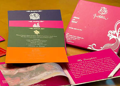
- Overcrowding the Design: Too many colors, fonts, or graphics can overwhelm the layout. Keeping design minimal ensures clarity and sophistication, helping important details stand out naturally.
- Choosing Low-Quality Paper: Poor paper quality reduces visual appeal and durability. Investing in good GSM paper ensures your invitation feels premium, sturdy, and worth preserving.
- Ignoring Readability: Using overly fancy fonts or small text makes details hard to read. Prioritizing legible fonts ensures your information is clear and accessible for all guests.
- Missing Essential Information: Forgetting venue details, timings, or RSVP contacts causes confusion. Double-checking ensures your card includes everything required for smooth event planning.
- Not Matching the Wedding Theme: A mismatched card disrupts the aesthetic flow of your event. Aligning colors and designs with your theme creates visual harmony and better representation.
- Skipping Proofreading: Spelling mistakes or incorrect dates can be embarrassing. Reviewing your card multiple times helps avoid expensive reprints and last-minute corrections.
- Ordering Too Late: Last-minute printing leads to rushed work and limited choices. Order early to allow time for design changes, approval, and safe delivery.